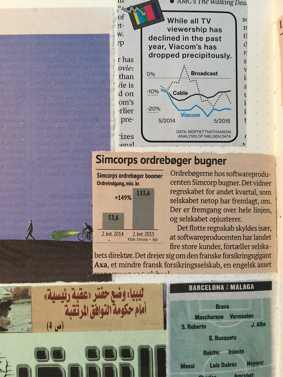
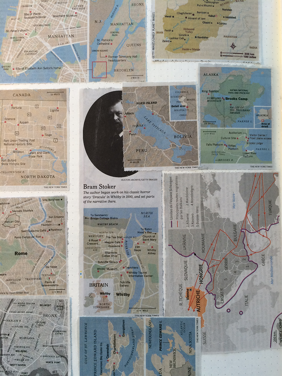
Design process: information design scrapbooking
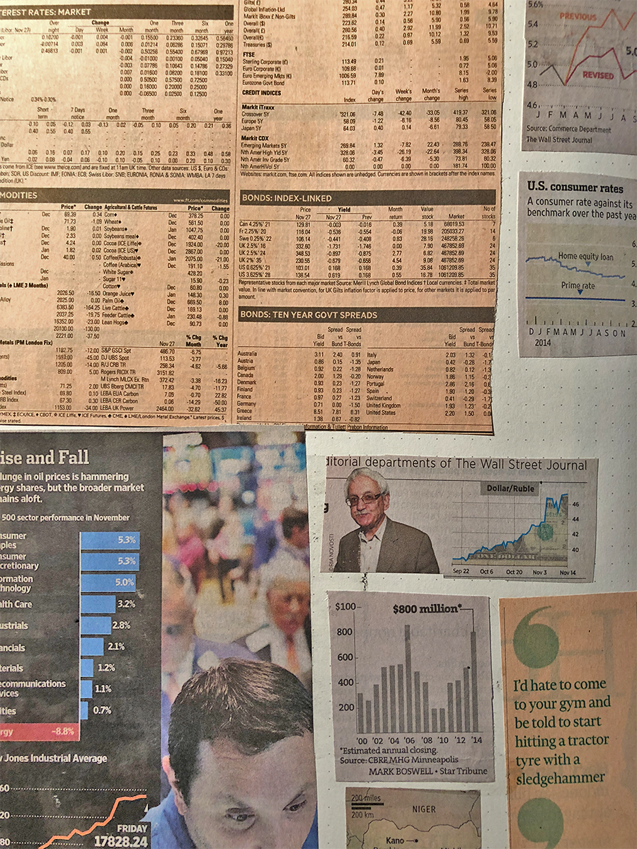
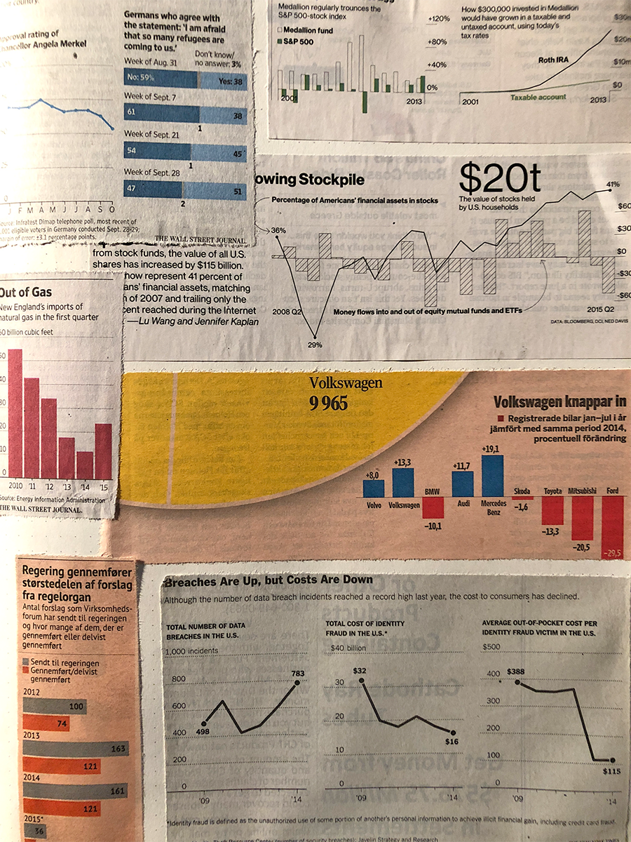
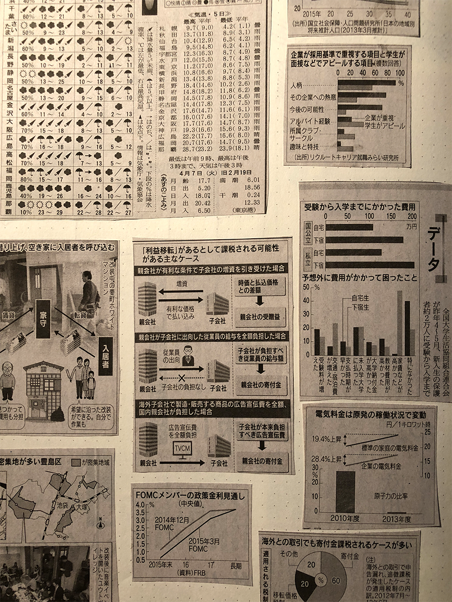
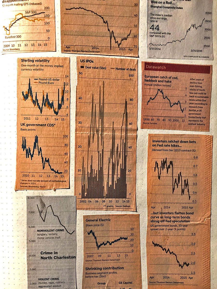
For years I’ve collected business and finance sections of newspapers from all over the place looking for examples of compelling, interesting, or unusual examples of information design. All these tiny examples serve as inspiration for my own analytics work to help me question my own assumptions and thought patterns.
Why do some people put the y-axis on the left, versus the right? Why are they using a line chart when a histogram tells a more accurate story? Why use time series data when story being told is about the present?
We all have our compulsions to (over-) analyze some aspect of the world around us and this is mine. One of them at least. Find a sampling of some my favorites below.